#127 – Need input
 This time, no redacted image! Â Today at work, I was doing storyboards again for this future Mars mission — and here’s a frame I can actually show. Â This is a made-up closeup of the rover’s main cameras, which sit on top of a rotating mast. Â (In the real world, it would look something like this.) Â What I’m trying to do in these storyboards is to give a little bit of personality to this robot. Â And hey, if you’re gonna do that, why not borrow from one of the classics?
[Comments and critique always welcome]
#121 – Oops, I Did It Again.
 I’ve been sketching a lot of these storyboard illustrations at work, and so I figured I could just use one of them for the daily post. Â Unfortunately, I realized that the rover pictured here is also based on some drawings that may or may not be public. Â I did several of these today, but nothing else, so a redacted version will have to do.
P.S. Sorry to “play with your heart,” get “lost in the game,” etc.
[Comments and critique always welcome]
#119 – Music, Markstro, Please!
#117 – Martian invaders
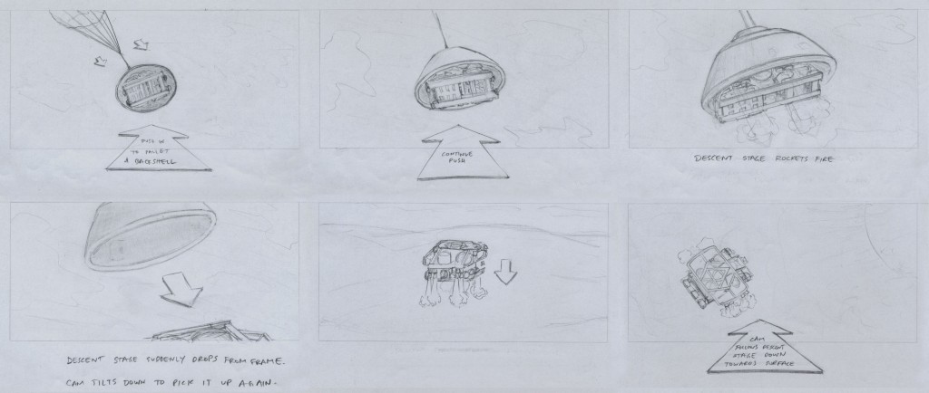
That is to say, invaders of Mars, not invaders from Mars. I’m starting to do some preliminary storyboard sketches at work for a new animation of a future series of proposed Mars missions. These first few are based on some existing work, but I’m going to have to start inventing stuff soon. Also, these early frames probably don’t make a lot of sense to the outside viewer, but some of the ones to come might.
[Comments and critique always welcome]
#114 – Get that man a tissue.
#111 – Alliteration & onomatopoeia
#110 – The good life
#101 – Analog cursor
 Tomorrow at work I need to do an illustration of a hand that will be used in a demo video for a touchscreen application. Â This was just a quick sketch to serve as a reference for the digital version. Â Then again, maybe my giant hands aren’t the best models for this — might have to recruit someone else tomorrow. Â Someone whose hand will fit on a sketchbook page.
[Comments and critique always welcome]
#99 – Leather and fur
 This is an expansion of yesterday’s sketch, prepping for the same digital illustration perspective assignment. Â I like the angle, but I was thinking of making it more visually interesting by putting it in that leather-helmets era of 1920s-ish college football. Â Could make for a good color palette and design aesthetic in the final piece. Â Also, I like the idea of having an unexpectedly female quarterback who’s about to make the big, game-winning play. Â I forgot to fix the proportions before doing this fleshed-out version, but I figured that could be fixed later in Illustrator.
Then I realized something: there’s no actual action taking place here. Â There’s anticipation of action, but that’s it. Â So the inset sketch is a new idea that would integrate action directly between the foreground and background elements. Â Of course, it also trades female empowerment for imminent demise of small, furry creatures. Â Hope that doesn’t reveal something about the artist…
[Comments and critique always welcome]


