Jun
24
2010
 Following on from yesterday’s sketch, these are a few iterations of a hand icon for a touchscreen demo video. Â I was trying out a few different ways of modeling some light and shadow on there. Â The last one is getting close; I’ll probably tweak it a little more in the morning and call it finished.
[Comments and critique always welcome]
5 comments | tags: digital, hand, illustrator, photoshop, vector | posted in Imagined
Jun
22
2010

So this is the outcome of the last couple of sketches. Â This idea sort of came from all the squirrels I always see on our street. Â They’re always leaping around in the trees, running along telephone lines, and pretty much having the run of the place. Â I guess I got to thinking how they’d do out in the country among actual predators. Â Somewhat less well, I imagine.
I guess the companion drawing to this would be the “country squirrel” wandering goggle-eyed into the street as a taxi bears down on him. Â But I think one impending-rodent-doom illustration is quite sufficient.
[Comments and critique always welcome]
2 comments | tags: animal, environment, illustrator, perspective, vector | posted in Imagined
Jun
21
2010
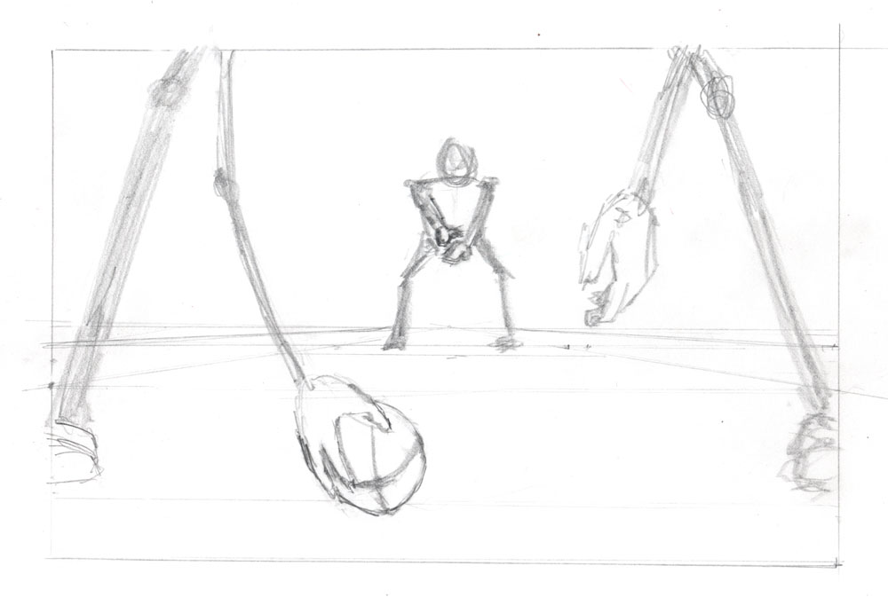
 This is an expansion of yesterday’s sketch, prepping for the same digital illustration perspective assignment. Â I like the angle, but I was thinking of making it more visually interesting by putting it in that leather-helmets era of 1920s-ish college football. Â Could make for a good color palette and design aesthetic in the final piece. Â Also, I like the idea of having an unexpectedly female quarterback who’s about to make the big, game-winning play. Â I forgot to fix the proportions before doing this fleshed-out version, but I figured that could be fixed later in Illustrator.
Then I realized something: there’s no actual action taking place here. Â There’s anticipation of action, but that’s it. Â So the inset sketch is a new idea that would integrate action directly between the foreground and background elements. Â Of course, it also trades female empowerment for imminent demise of small, furry creatures. Â Hope that doesn’t reveal something about the artist…
[Comments and critique always welcome]
2 comments | tags: animal, environment, figure, graphite, hand, helmet, pencil, perspective | posted in Imagined
Jun
20
2010
 I’m working on a new digital illustration that’s meant to incorporate some kind of action between foreground and background elements. Â This is just a quick exploratory sketch to see if this kind of composition could work for it. Â Things would obviously need to be shifted around a bit, but I think the basic camera angle will work.
[Comments and critique always welcome]
no comments | tags: figure, graphite, hand, pencil, perspective | posted in Imagined
Jun
19
2010
 A quick memento sketch from another great weekend activity. Â Thanks to the legendary Mr. McKown for his hospitality!
[Comments and critique always welcome]
no comments | tags: isometric, object, pencil, prisma, tabletop | posted in Imagined
Jun
15
2010
 Taking the concept drawings from yesterday to the next level. There are still many things I would want to do differently, but the idea starts to come together. This would benefit from a lot more details throughout. I did have enough time to add a few details to the rovers (shown below), but overall there is a lot more time that would need to be invested in this idea.
 [Comments and critique always welcome]
no comments | tags: digital, environment, illustrator, isometric, vector, vehicle | posted in Imagined
Jun
14
2010
 A second attempt at some exploratory sketches for a future settlement on Mars. I stepped it back a bit and took inspiration from desert bunkers, remote stations and the like. I’m trying to think a little more realistically about what kind of stuff would really be taken to Mars. But to avoid everything looking totally utilitarian, I modified the greenhouse dome a bit, drawing on inspiration from the design of London’s city hall (file under: Inevitable Dash of Pretension).
[Comments and critique always welcome]
2 comments | tags: environment, graphite, isometric, pencil, vehicle | posted in Imagined
Jun
13
2010
 Yuck — don’t like this at all. I got a digital illustration class assignment to create some sort of isometric world. Thought I’d do something with a city settlement on Mars. So I created these buildings, kind of inspired by a couple of reference photos, but they just both ended up looking like hideous, drab, public museum architecture of the late 1970s. In fact, I realized one of them looks very similar to this previous sketch of the El Paso Science Musuem.  Quick Google search: that museum opened in…wait for it…1980.
Suffice it to say there is some re-imagining to be done.
[Comments and critique always welcome]
no comments | tags: environment, isometric, pencil, prisma | posted in Imagined
Jun
12
2010
 First ball-point pen drawing, and first napkin drawing! Â Drawn at an awesome 50’s/60’s martini party, while dressed like a classic NASA nerd.
[Comments and critique always welcome]
3 comments | tags: ballpoint pen, napkin, object, tabletop | posted in Imagined
Jun
11
2010
 Been thinking a lot about my 365 project today. I’m really enjoying this, and am almost a quarter of the way finished already. Â If you’re not doing a daily (or weekly) creative project yourself, please think about starting one!
[Comments and critique always welcome]
no comments | tags: pencil, perspective, prisma | posted in Imagined
 Following on from yesterday’s sketch, these are a few iterations of a hand icon for a touchscreen demo video. Â I was trying out a few different ways of modeling some light and shadow on there. Â The last one is getting close; I’ll probably tweak it a little more in the morning and call it finished.


